Friday, October 13, 2017
Markov Chains and Markov Process - Part III
Thursday, October 5, 2017
Markov Chain and Markov Process - Part II
 |
Taking a sick leave |
The discussion on markov chain and markov process as a special case of conditional probability is continued today with an example of sickness and good health. The state of good health or bad health tomorrow for an individual can be explained by Markov Chains and Markov Process in the following manner.
P(bad health tomorrow )
=P(bad health today)P(bad health tomorrow|bad health today)+P(good health today)P(bad health tomorrow|good health today)
If a person is ill today then the probability that he/she will feel ill tomorrow is higher than the probability that the person with good health feeling ill tomorrow.
This can be explained by following notation.
P(bad health tomorrow|bad health today)>P(bad health tomorrow|good health today)
What is the probability that a person is ill on the third day (of the week)?
P(Bad health on third day)=P(bad health on second day)P(bad health on third day|bad health on second day)+P(good health on second day)P(bad health on third day| good health on second day)
This can be interlinked (like a chain) to the following expression
P(Bad health on second day)=P(bad health on first day)P(bad health on second day|bad health on first day)+P(good health on first day)P(bad health on second day| good health on first day)
This inter-linkage (chain) will be discussed in detail in the next blog.
Friday, September 15, 2017
Markov Chains and Markov Processes

Here the concept of conditional probability discussed in previous days blogs (July 14 - July 30, 2017) is extended to Markov chain and Markov Processes.
Let,
P(Rainy Day) = 0.3
P(Dry Day) = 0.7
We know that if it rains today then there are high chances that it might rain tomorrow that is the probability that it will rain tomorrow is high. So the conditional probability that it will rain tomorrow given that it rains today is higher than the unconditional probability that it will rain tomorrow.
Notation wise
P(Rain Tomorrow|Rain Today)>P(Rain Tomorrow)
Conditional Probability>Unconditional Probability
P(Rains tomorrow)=P(Dry Today)P(Rains Tomorrow|Dry Today)+P(Rains Today)P(Rains Tomorrow|Rain Today)
Markov Processes are systems where outcome of the current state is highly dependent on the outcome of immediately preceding state. Examples can be weather systems and state of well being of an individual. Here outcome of state today is heavily dependent on the outcome of immediately preceding state. So probability that it rained one month ago has less influence on the probability that it rained today than the probability that it rained yesterday. State of well being of an individual can also be explained in the following manner. So these examples explain special case of conditional probability namely markov chains. This will be discussed in detail in the next blog.
Wednesday, August 23, 2017
Expectation and Conditional Expectation

The discussion on probability and conditional probability (previous day's blog) is continued to expectation and conditional expectation.
Let Z be a random variable denoting money spent by the state on the cardiac care of a citizen below 40 years.
E(Z) is the average money spent by the state per citizen below 40 years on its cardiac care.
E(Z)=P(Y1)E(Z|Y1)+P(Y2)E(Z|Y2)
=(Probability of a Heart attack before 40)(Average money spent by the state on caradiac care of a citizen with an incidence of heart attack before 40 years)+(Probability of no heart attack before 40 years)(Average money spent by the state on cardiac care of a citizen with no incidence of heart attack before 40)
so,
Expectation=Probability(condition1)* Conditional expectation+Probability(condition2)* Conditional expectation
Sunday, July 30, 2017
Probability and Conditional Probability
The discussion is being continued.
So,
Y1 stands for incidence of a heart attack before 40.
Y2 stands for no incidence of a heart attack before 40.
X stands for the event of Blood pressure and Blood sugar beyond normal limits and cholesterol within normal limits.
 |
Expenses on Cardiac Care |
 |
Probability and Conditional Probability |
Wednesday, July 26, 2017
Probability and Conditional Probability
This is in continuation of the discussion on Probability and Conditional Probability of the Previous Blog.
Now we are using a general notation. Then the equation get's reduced to the following form.
Now we are using a general notation. Then the equation get's reduced to the following form.
 |
Probability and Conditional Probability |
Tuesday, July 18, 2017
Visualization of Probability & Conditional Probability
The tree diagram given in the image below helps visualize the
main difference between conditional and unconditional probability. Here we
continue with the example of the previous blog where conditions leading to a
heart attack before 40 years are minutely analyzed.
 |
Visualization of conditional probability |
 |
Probability and Conditional Probability |
Friday, July 14, 2017
Understanding conditional probability through Venn Diagrams
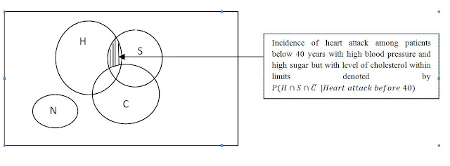
Conditional probability is normally computed under some additional conditions and "unconditional probability" is the probability where no additional conditions are provided. This is illustrated with example mentioned in the previous blog. Here the probability of having a heart attack before 40 years of age is minutely analyzed by a Venn Diagram. The venn diagram below shows a rectangle representing all people ( in an area) below 40 years. The circles H, S, C and N are those who have suffered a heart attack. The other region represents those without a heart attack. The shaded region in the diagram below gives the probability that a patient with high level blood pressure and sugar but the level of cholesterol is within limits has a heart attack before 40 years of age. This is the ratio of number of elements in the shaded region divided by the total number of elements in H, S, C and N.

Friday, July 7, 2017
Understanding Venn Diagrams
 | ||
Incidence of Heart Attack Below 40 years of AgeWe are interested in finding the probability of a heart attack below 40 years of age. Venn diagrams help visualize the scenario of people having heart attack before age of 40 including those with high blood pressure denoted by H, high sugar denoted by S and high cholesterol denoted by C or a combination of these. N denotes those individuals who have stroke before 40 and have blood pressure, sugar and cholesterol within normal limits. The image below shows the venn diagram of those cases where the blood pressure and sugar are beyond normal limits but cholesterol is within the limits. This way all the possible causes resulting to a heart attack before 40 years can be minutely analyzed and it's probability can be calculated. This analysis is based on collected data and can aid in correct diagnosis.
|

Tuesday, June 27, 2017
Exploring aic (Akaike Information Criterion)
 |
Goodness of Fit of Statistical Models |
aic plays a key role in the interpretation of efficiency of probability models with respect to a model of reference. Here the ratio of two likelihood functions is taken and it is equivalent to the difference between the two loglikelihood functions. So the greater the difference between loglikelihood functions the greater is the difference in efficiency between the models.
aic=-log(L(P1)/L(P2))+k
Here P1 is estimator of the parameter of model 1 and L(P1) is the likelihood function obtained from probability model 1. L(P2) is the likelihood function obtained from probabilitymodel 2, with P2 as the estimator of the parameter of this model. k is the degree of freedom.
aic = -[log(L(P1))-log(L(P2))]+k
This expression shows that the greater the difference [log(L(P1))-log(L(P2))] the higher the value of aic. So high value of difference indicates greater dissimilarity between model 1 and model 2. For relatively close models aic should be lower than the aic of relatively distant models. Smaller value of aic implies that the fit is good. The model with higher value of aic ( with respect to a model of reference)should be rejected.
Saturday, June 24, 2017
Fertility Rates as Development Indicators
 |
Vital Statistics as Development Indicators |
 |
Comparison between Germany and India |
Monday, June 19, 2017
Fertility Rates as Development Indicators
 |
Development Indicators |
Commonly used fertility measures are Total Fertility Rate (TFR), Age Specific Fertility Rate (ASFR), Crude Birth Rate (CBR), Net Reproduction Rate (NRR) and Gross Reproduction Rate (GRR). The rate of growth of population is viewed from different perspectives through these measures. Total fertility rate (TFR) is defined as the number of children that a woman bears in her entire fertility span. According to 2011 census TFR of Nepal is 2.52 with 1.52 for urban areas and 3.08 in rural areas. This means that a woman bears 2.52 children in her entire life span. The women in urban areas bear 1.52 children whereas the women in rural areas bear 3.08 children. TFR of Nepal in 1971 was 6.32. This shows that Nepal has made a big progress in the reduction of TFR from 6.32 in 1971 to 2.52 in 2011. A low TFR is related to high average life expectancy and low Infant Mortality Rate (IMR). In 2011 Census TFR of 2.52 is coupled with 66.6 years of average life expectancy and 40.5 IMR, implying that in 2011 a woman bears 2.5 children in her life time, a child born has life of on average 66.6 years and there are 40.5 infant deaths per 1000 live births. In the absence of use of contraceptives and birth control measures the TFR of a country is around 6. This is reflected by TFR of Nepal in 1971 of 6.32. High TFR is coupled with high IMR and low life expectancy at birth. This fact is validated by the rural and urban differential in these measures. According to 2011 census of Nepal, TFR urban is 1.54 and TFR rural is 3.08, IMR urban is 24.06 and IMR rural is 42.9 and finally the life expectancy at birth of Urban areas of Nepal is 70.5 and 66.6 for rural areas. High TFR indicates poor health facilities and health conditions in governmental hospitals in rural areas in contrast to urban areas. This is also coupled with a lower value of average life expectancy in rural areas and a very high IMR. High IMR also implies large deaths of infants due to poor nutrition of mother and poor health facilities. Many countries in Africa like Sierra Leone, Angola have high incidence of diseases like Malaria and HIV AIDS have low average life expectancy (50.1and 52.4 years respectively in 2016) and high TFR (4.76 and 5.31 respectively in 2016). Many countries with low TFR (lower than 2), have a declining population as two people mother and father are replaced by less than 2people. Countries with low TFR have high average life expectancy and low IMR. For example in 2016, TFR of Italy is 1.43, this is very low and it is coupled by a very low value of IMR of 3.3 deaths per 1000 live births and average life expectancy of 82.7 years. This is due to good health facilities provided by the government of such countries. A low value of IMR also indicates good nutritive diet received by the mother. So TFR can be related to the development status of a country, where a country with low TFR has high socioeconomic and developmental status in contrast to countries with high TFR. This discussion will be continued in the coming BLOGS.
Thursday, June 8, 2017
Maximum Likelihood Estimation illustrated with an example
 |
Predicting the risk of Zika Virus infection |
Tuesday, June 6, 2017
Exploring MLE and Maximum Likelihood Estimation
 |
Maximizing the Likelihood |
Maximum likelihood estimation chooses a sample statistic that maximizes the likelihood (probability function) of occurrence of sample for a particular parameter. Maximum likelihood estimation is based on the concept of Maxima and Minima. Through maximum likelihood estimator (MLE) an estimator is chosen; this estimator maximizes the likelihood of occurrence of the sample. The probability function of the occurrence of the sample is maximized by taking the derivative of the log of the likelihood function (with respect to the parameter) and equating it to zero. This gives an estimator ( based on the sample) of the parameter. The second derivative of this loglikelihood function will be less than zero for this MLE. We also know that the probability function of this sample is based on a population parameter. Population is unknown and so is the population parameter. But the sample is known and we try to find the estimator based on the sample. This estimator maximizes the probability (likelihood) of this sample. For example
Xi~B(n, P) that is X follows Binomial with parameter n and P. Here i = 1, 2, ....m
Then the MLE of P is Sum of Xi (over all m)/nm and is given in the image below. This will be illustrated with an example in the next blog.

Tuesday, May 30, 2017
Rate or Ratio?
 |
Mortality Rates
Vital Statistics analyzes vital events occurring in the life of an individual. Mortality, fertility and migration are some examples of such vital events. Vital statistics comprises of measures such sex ratio, crude birth rate, crude death rate etc. But terms Rate and Ratio are some what ambiguous. The definition of ratio here doesn't seem to confirm with the traditional mathematical definition which is as follows. A ratio is written as " a to b" or "a:b" and is expressed as quotient of two numbers. Rate is mathematically defined as quantity measured with respect to another quantity. So rates are always defined in terms of two units like miles per hour for speed or number per milliliter of water for bacterial growth.
This ambiguity is illustrated with following example. Sex ratio is defined as number of males per 100 females. So if sex ratio is 106 means by definition that there are 106 males per 100 females. So sex ratio 106 doesn't confirm with the traditional mathematical definition of ratio. Also if sex ratio is given as 1.06 then one should conclude that there are 1.06 males per 1 female which is equivalent to the previous statement of 106:100. Now maternal mortality ratio (MMR) is defined as annual number of maternal deaths due to pregnancy related causes per 100,000 live births. But maternal mortality rate (MMR)is also number of maternal deaths per 100, 000 live births. Similarly Crude death rate (CDR) is number of deaths per 1000 people in the population and Infant mortality rates (IMR) number of deaths of infants per 1000 live births.
Intuitive approach is the best possible option for finding a way through this ambiguity. We should not be carried away by these numbers and loose our way in this ambiguity of definition. We should rather link these mathematical figures with country specific scenario. This way we will not loose track of the main objective, which is getting a clear picture of development status of that country.
.........and one more tip in case of frequent events like birth and death it is per 1000 and in case of less frequent events like cause specific death rate it is expressed per 100,000.
|
Friday, May 26, 2017
Relation between Binomial, Poisson, Geometric and Negative binomial distributions
 |
A small grocery store in a very busy market square |
The interrelationship between these distributions is illustrated with following example.
Suppose that there is a small grocery store located in a very busy market square with several big stores and shopping malls. Hundreds of people are walking in this market square in a Saturday morning. Then the number of people entering this store is a random variable following Poisson distribution. Number of people making purchases upon their entry into this shop is a random variable following Binomial distribution. Number of people making purchases before a person leaves the shop without buying anything is a random variable following geometric distribution. And lastly the number of people entering the shop before third person makes purchases more Rs. 5, 000/- is also a random variable and follows negative binomial distribution.
In this example, different random variables governed by probability law of different probability mass functions explain different aspects of a purchase in a small shop.
Sunday, May 21, 2017
Statistical Analysis and Modelling of Vital Events
 |
Mortality and Fertility Models for Countries with Limited Data |
My book titled " Mortality and Fertility Models for Countries with Limited Data" is available on Amazon.
It elucidates in a simple manner various methods of data generation, correction, prediction, analysis and interpretation. Here I discuss the statistical analysis of vital events namely Mortality , Fertility and Migration for countries with limited data like Nepal and India.
Various techniques of data correction, data analysis and data prediction can be learnt from this book. There are several examples of vital events from Nepal, India and Germany in this book.
 |
Learn various statistical techniques of data correction, analysis and interpretation |
Friday, May 5, 2017
Insights into the concept of hypothesis testing (last Part)
When alpha is 0.025(z
= 1.96) beta is 0.1866 and when alpha reduces to 0.005 (z = 2.55) beta
increases to 0.3538.
When alpha is
0.025
 |
Alpha is 0.025 and Beta is 0.1861 |
 |
Alpha is 0.005 and Beta is 0.3583 |
 |
The mathematics mentioned above is explained in this image |
Tuesday, May 2, 2017
Insights into the Concept of Hypothesis Testing (Part 14)
 |
| Alpha decreases beta increases |
Sunday, April 30, 2017
Insights into Concept of Hypothesis Testing (Part 13)
Decreasing Type I Error Increases Type II Error
 |
Decreasing alpha increases beta |
Population 1= {1, 1, 2, 2, 2, 2, 3,
3, 3, 3, 3, 3, 3, 4, 4, 4, 5, 5}
Population Mean = 3 and Population
variance = 1.263
Population 2 = {3, 3, 3, 4, 4, 4,
5, 5, 5, 5, 5, 5, 5, 6, 6, 6 }
Population Mean = 4.944, Population
Variance = 1.719
The probability of rejecting a true
null hypothesis is denoted by α (alpha) . Rejection of a true null
hypothesis is called Type I Error. In the adjacent figure we see that alpha is
the area of the region where sample coming from a parent population with mean 3
is still rejected and it is falsely concluded that it comes from a parent
population with mean 4.944. Committing Type I error disturbs the status quo. So
minimize this error and minimize alpha. But when we try to minimize alpha we increase
beta, as seen from the area of alpha and beta shown above.
Thursday, April 27, 2017
Insights into Hypothesis Testing (Part 12)
Understanding Mathematics
behind Type I Error and Type II Error
Let’s consider the following population.
Population 1 = {1, 1, 2, 2, 2, 2, 3, 3, 3, 3, 3, 3, 3, 4, 4,
4, 5, 5}
Mean = 3, Mode = 3, Median = 3
Population 2= {3, 3, 4, 4, 4, 4, 5, 5, 5, 5, 5, 5, 5, 6, 6,
6, 7, 8}
Mean = 5, Mode = 5, Median = 5
As shown in the blog of previous day if sample mean is more
than 4.27 we conclude that the sample doesn’t belong to Population 1 and we
commit type I error. But if the sample mean is less than 4.27 we accept the
null hypothesis. Either we accept a true null hypothesis or accept a false null
hypothesis. Type I error and Type II error with respect to Population I and
Population mentioned above are explained by the following diagram
 |
| Type I Error and Type II Error |
Sunday, April 23, 2017
Insights into concepts of hypothesis testing (Part 11)
Demonstration of Type I Error
with an Example
This
example demonstrates how Type I error can be committed. Suppose this is population data Population = {1,
1, 2, 2, 2, 2, 3, 3, 3, 3, 3, 3, 3, 4, 4, 4, 4, 5, 5}.
It
is a symmetric population with Population Mean = 3, Population Mode = 3 and
Population Median = 3. These are unknown, but for the sake of ease of
comprehension I have mentioned it here. Let’s draw a sample of size 3.
Sample
= {4, 5, 5}
Due
to variations in sampling we can get such an extreme sample with sample mean =
4.66. We test the hypothesis that this
sample comes from a population with mean 3.
Null
Hypothesis: Population Mean is equal to 3
Alternative
Hypothesis: Population Mean is not equal to 3
Under
the assumption that population standard deviation is known and is 1.1239 the Z
test statistics
is
2.55 and is more than 1.96. So here the null hypothesis is rejected at 5% level
of significance and we conclude that the sample doesn’t come from this
population. The p value is 0.0053. If the sample mean is greater than 4.27 we have to reject the null hypothesis and conclude that the sample mean is not 3.
 |
| Sample mean more than 4.27 than we reject the null hypothesis |
Friday, April 21, 2017
Insights into concepts of Hypothesis Testing (Part 10)
Assumption of
Normality of Parent Population
The population from which a
sample is drawn is called a parent population. This parent population is
usually unknown. Parametric tests under testing of hypothesis are based on the
assumption of normality of parent population. Non parametric tests are not
based on this assumption. Today’s discussion delves deeper into this assumption
of normal population. We look at various transformations that convert a skewed
(non normal) population to a normal population.
For the sake of simplicity let’s
consider the following population. It is unknown under normal conditions.
Population = {1, 1, 1, 1, 1, 1,
2, 2, 2, 5, 5, 20, 25}
This is a non normal or a
positively skewed data. It is represented by following frequency curve on the
left side of the image. Here. Hence Mode<Median<Mean for a positively
skewed data.
If the population was normal it’s
simplified version will be the following.

Population = {3, 4, 5, 5, 5, 5,
5, 5, 6, 7}
It is represented by the
frequency curve in the right side. Here Mean = Mode = Median = 5. For a normal
data, Mean = Mode = Median.
For conducting parametric tests
the parent population should be normal where mean, mode and median are very
close to one another.
Some transformations like
logarithmic, square root and power (1/4) can transform a skewed data by
bringing the mean, mode and median closer to each other. But these transformations
don’t change the shape of the frequency curve.
After we conduct logarithmic transformation
to the non normal population that is {1, 1, 1, 1, 1, 1, 2, 2, 2, 5, 5, 20, 25},
Mean = 5.15, Median = 2 and Mode = 1 changes to Mean = 0.385, Median = 0.301
and Mode = 0. After doing the square
root of the original data Mean = 1.86, Median = 1.414 and Mode = 1. And if
power (1/4) is done for the original data, Mean = 1.3007, Mode = 1 and Median =
1.189. But these transformations don’t change the shape of the frequency curve.
This is illustrated by the image below giving the screen shot of the excel
worksheet comparing different transformations.

Thursday, April 20, 2017
News “cycling to work can halve cancer risk” - from a statistical perspective

Holiday Special
Update III
Today’s blog gives a statistical
perspective on the article published in BBC health news on 20 April 2017 titled
“Cycling to work halves cancer risk”.
Risk to a disease means the
probability of catching that disease. Catching of a disease in an individual’s
life time is a random event and it is a function of time. So denoting X(t) as a
random variable denoting the state of having a disease (say cancer) at time t
takes two values 0 and 1. x (t) = 0 implies a disease free state with some
probability P(x (t) = 0) denoted by p1 and
x(t) = 1 implies the existence of a disease at time t with probability
P(x(t) = 1) denoted by p2. Here p1+p2=1, because either an individual is in a
state of health or he/she has a disease at time t and these two states are
exhaustive and mutually exclusive. This disease could be as common as common
cold or not as common as cancer. For a healthy and young individual p1>p2
and as time progresses implying that as an individual become older and older p2
becomes closer and closer to 1. These probabilities can be explained by a
probability distribution. Diseases those are common in modern day life like
high blood pressure and sugar can be explained by Binomial probability
distribution. This distribution tends to normal distribution when the size of
population is large. The incidence of not so common diseases/rare diseases can
be explained by Poisson distribution and Negative binomial distribution. Normal
distribution is a limiting case for these distributions as well. As the news
says ”Cycling to work can halve the cancer risk”, this implies that p2, which
is the probability of catching a disease (cancer) at time t is reduced by half
when people cycle to their places of work. Similarly regular exercise and consumption
of balanced diet can also reduce p2. p2 is a function of time/age and it
increases as age increases. But its growth can be checked by cycling to work.
Human life is governed by several
random events. These occurrences can be statistically analyzed by the probability
distribution of random variables that explain these random events. Clinical trials and data based research give
us an idea of values of these p1 and p2. This is an evidence/data based approach of
estimating p1 and p2. This kind of research complements laboratory based
research. If time and energy is invested in making a foundation of good quality data, then
breakthrough results can be obtained with much less time and money.
Monday, April 17, 2017
News “Publication of Gender Biased Books” - from a statistical perspective
Holiday Special
Update II

Today’s blog gives a statistical perspective
on the article published in BBC Asia on 15 April 2017 titled “India’s enquiry
into sexist text books” and also on BBC radio journal talk ”Gender biased books”.
Gender biased is not gender
balanced. Gender biased means giving preference to one specific gender. The
article published in BBC Asia on 15 April 2017 “India’s enquiry into sexist
text books” and talk program in BBC radio journal “Gender biased books” try to sensitize
us to the importance of having gender balanced views for the sustainable
development of the society. But what is gender balanced? Gender balanced attribute
implies, maintaining the natural balance between number of male and number of
female with respect to that attribute. Sex ratio measures this ratio between
the number of male and the number of female.
It is normally defined as the number of males per 100 females. Sex ratio
at birth measures this ratio between male and female at the time of birth.
Under normal conditions and in the absence of any external biological
intervention the sex ratio at birth is between 103 and 105. This implies that there are normally 103 – 105
male births to every 100 female births. So if there are 100 births then 50.74% [(103/203)*100]
are male and 49.26% are female. This is the gender balance given by nature.
For the publications to be gender
balanced same ratio has to be maintained implying that for every 10 books
published in the market 5 – 6 should portray male perspective of an issue and
4- 5 books should portray female perspective of the same issue. Or if there are
10 stories published in a book, 5-6 stories should have male in a lead role and
4-5 should have female heroines. So when a reader reads the entire book, he/she
has an idea of how a man would think and also of how a woman would tackle an
issue. Reading gender balanced books result in development of impartial views
on any issue.
According to census 2011, sex
ratio is 94 for Nepal. There are 94 male per 100 female when whole population
of 2011 is taken into consideration.
Census 2011 tells that sex ratio in the age 00- 04 years is 105. So this
drop from 105 to 94 is attributed to increased life expectancy of females in
all age groups. Vast rural urban differential existing in many developing
countries including Nepal is also reflected in the sex ratio. Sex ratio
is 104 for urban areas and 92.3 for rural areas. Male from rural areas migrate
for education and employment to urban areas. Thus sex ratio in urban areas is
higher and more than 100 in comparison to sex ratio of rural areas.
So what is
gender balanced and what is gender biased? If sex ratio is close to 100 with
respect to an attribute then that attribute is gender balanced and if sex ratio
is much less than 100 or much more than 100 then it is gender biased.
Saturday, April 15, 2017
Today’s news “World’s oldest person dies at 117 years” - From a statistical perspective
Holiday Special
Update

I am on a summer vacation this
week. There will not be regular daily updates but a holiday special update. I
will look at the News published today in BBC on 16 April 2017, “World’s oldest
person dies at 117 years” from statistical perspective. This lady hails from
Italy and the average longevity of an Italian female is 84.8 years (source: http://www.worldlifeexpectancy.com/italy-life-expectancy).
Italy ranks top sixth in 2015 in the global ranking of average life expectancy.
Average life expectancy is a development indicator of that country. Higher
average life expectancy means higher standard of living and better health care
facilities provided by the government. Many questions arise in our mind as we
read this news. Some of them are the following.
1. What
is it like to be the world’s oldest person?
2. What
is the probability of being world’s oldest person?
3. What
is the probability of being in a country’s top 2% longest living people?
Life Tables tries to address
these questions and gives the mortality experience of a group called Cohort. l(x),
q(x), L(x), T(x) and e(x) are some of the columns of Life tables. l(x) gives
the conditional probability of surviving till age x given that a person has lived
till age x-1. q(x) is the conditional probability of dying before age x given
that the person has lived till age x-1. L(x) is the number of person years
lived between x-1 to x. T(x) is the total number of person years lived till age
x. e(x) is the average life expectancy at age x. The values of this life table
are governed by the current mortality experience.
I will focus on
the last column of life tables that is e(x) and specially on average life expectancy
at birth e(0). The average life
expectancy of a Nepalese Woman is 67.97 years (Source: Population Monograph of
Nepal 2014). Due to vast rural and urban differential in health facilities
which are common to all developing countries, it is 71 years in urban area and
68 years in rural areas. This implies that under given health conditions and
under given socioeconomic conditions a woman on average lives till 71 years in
urban areas of Nepal. If this woman belongs to rural areas, she is exposed to
the socioeconomic status and health conditions of rural areas and lives till 68
years on average. This is a very promising figure indicating that a woman of
Nepal has 67.97 years to fulfill all her dreams and aspirations. In contrast to
Nepal a woman from Italy has 84.8 years to meet all her dreams and aspirations.
So she has on average 17 more years to live. The Italian lady mentioned in the
BBC news today exceeded every Italian citizen with an average life expectancy
of 82.7 years (Source:http://www.worldlifeexpectancy.com/italy-life-expectancy)
by living till 117 years.
The life
expectancy at birth for a female in Nepal has increased from 28.5 years in 1954
to 67.9 years in 2011 (Source: Population Monograph of Nepal 2014). This is due
to increasing modern health facilities that have reduced death rates such as
maternal mortality rates, infant mortality rates and child death rates. If we
assume that the standard deviation is 2 years then what is the age for top 2%
in terms of female life expectancy for Nepal. The average life expectancy is normally
distributed. The women living higher than 72 years comprise the top 2% of
the female population given that the average longevity is normally distributed
with mean 67.9 years and standard deviation of 2 years. This is under the current mortality
conditions. This portrayed in the image below.

Subscribe to:
Posts (Atom)